In this syndicated post, Mike Wlliams (founder of Thinkbox and Founder Institute Mentor) outlines how you can create an app from idea to launch - in just 30 days.
The article, "Idea To App Launch In 30 Days", has been republished below with permission.
At Thinkbox we move fast. In the past few months we have launched a new product every 30–45 days. We do not only just focus on the speed of our builds, but we also take a methodical approach to our process so that we can go from concept, build, testing, launch, and scale as quickly as possible with minimal resources. We are also increasingly transparent on our projects, so we want to shed some light on our typical workflow. We will use our recent project Yoroomie App as a reference.
Yoroomie App was first pitched as an idea to the team one Friday morning during our 9am standup. Since the idea was a solution to our founders personal problem that was faced when searching for a roommate, we had an initial first-hand validation. By the end of our standup, we had reached a team consensus that the current methods for finding a roomie were not ideal, and we would build a product solution for the easiest way to find a roomie.
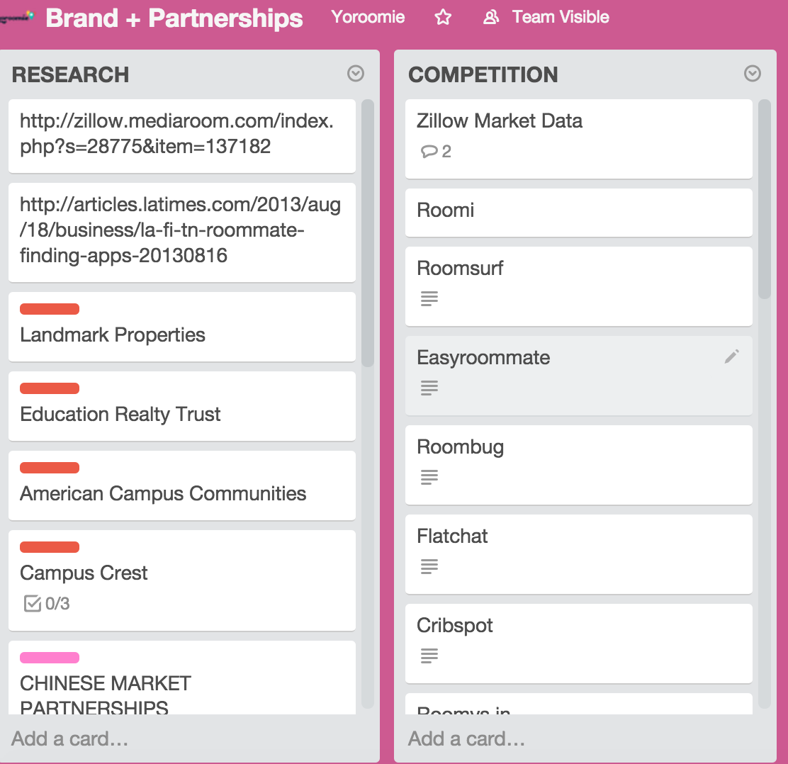
The weekend was spend exhaustingly researching our competition and Monday morning presenting our findings to the team (See Trello screenshot for research example below). This would be essential in our product and business differentiation. We also did user onboarding tear-downs for other mobile solutions in the market to find product normalities.

Screenshot example of our Trello board used to identify, prioritize, and also reference competitors in the shared rental space.
Since the goal for week 1 was product and lean branding, we had enough reference to move forward with our flows and individual screens for the app following our weekend research. For our lean branding initiative, the logo was done in one day and we decided on a color palette that would resonate with the look, feel, and our target demographic for our users. The rest of week 1 was spent flushing out the rest of the screens and also finalizing our product roadmap.
Week 2 was a sprint that focused on our prelaunch campaign while starting on the actual development. Our design resources shifted towards mocking up a landing page to capture emails that we could notify and drip to convert installs when we launched. This would be essential for building initial traction at launch (post on our prelaunch campaign here).
Week 3 started with increased team moral as development was on-schedule and we were beginning to test our first build. Facebook authentication provided for account creation, then populating our first screen in the user profile. The UX focused on streamlining the onboarding process, so the steps leading up to the main map interface to discover other roomies was painless (as a side note we are huge fans of the hook, investment, and reward methodologies so we relate our user experience and are design forward with this in mind). During this week we also worked on not only the app, but beginning to identify admin requirements we would need, analytics that we wanted to track, and our KPI’s.

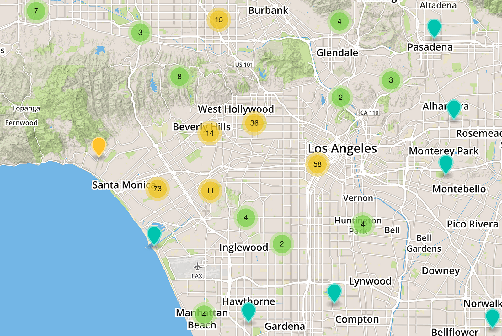
Our “God View” would allow us to track users, pins, and also flag potential abuse realtime. This is a mock above for visual example purposes.
Week 4 started Monday morning and the team knew that we had to have the app ready for submission by Friday. For design, we focused on creating visual assets for all of our social media accounts, creating info graphs to educate our users, and also our website. On the development side we were heavily testing our map interface for issues like surfacing pins based on the view (also testing geo-clustering), and also our messaging functionality. On the business side we were already executing on our basic launch strategy framework that we use (for all of our projects), which would rely heavily on crafting our story for Yoroomie and pitching to the press. By Friday we were ready for our build to be submitted and had all of our marketing, launch, and partnership initiatives in motion to ensure that the launch (when the app was approved by Apple) would be successful. By the end of the day Friday, we packaged and submitted Yoroomie to the app store!

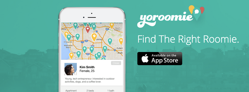
Website mock and social media header used for launch.

Be sure to follow me on Twitter @yoroomie. Also, subscribe to our stories at Thinkbox for more about the products we launch, what we’re working on, and our learnings.


